
Disable Squarespace Background Videos on Mobile
Sometimes a Squarespace background video looks great on desktop but gets weird on mobile. The crop might feel off, the important part of the video might not stay centered, or the section height might need to be taller than you actually want just to make the video look okay.
In cases like that, it may be easier to show the fallback image on mobile instead of the video.
Prerequisites:
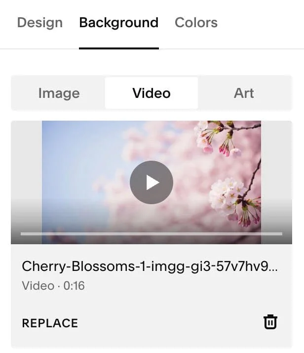
1. Background Video linked or uploaded.
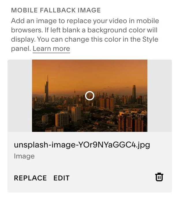
2. Mobile Fallback Image uploaded
Here’s the CSS:
@media only screen and (max-width: 767px) {
  .sqs-video-background-native__fallback-image--hidden, .sqs-video-background .custom-fallback-image.loaded {
      opacity: 1 !important;
    }
    #player, .video-player {
      opacity: 0 !important;
    }
}
That’s it.
If you want it to target a specific section:
1. If you haven’t already go and download the Squarespace ID Finder Chrome Plugin from Will Myers here
2. Find the section ID of the section you want to target
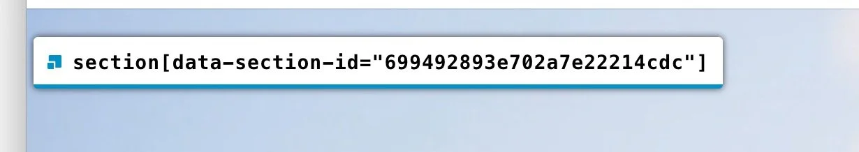
3. Add the section ID to your CSS
@media only screen and (max-width: 767px) {
  //replace this section id with yours
  section[data-section-id="699492893e702a7e22214cdc"] {
    .sqs-video-background-native__fallback-image--hidden, .sqs-video-background .custom-fallback-image.loaded {
      opacity: 1 !important;
    }
    #player, .video-player {
      opacity: 0 !important;
    }
  }
}
If you want it on every first hero section on your site:
@media only screen and (max-width: 767px) {
  #sections section.page-section:first-child:has([class*="sqs-video-background"]) {
    .sqs-video-background-native__fallback-image--hidden, .sqs-video-background .custom-fallback-image.loaded {
      opacity: 1 !important;
    }
  }
}
This keeps the fallback image visible on smaller screens, so mobile visitors see the image instead of the background video. Just make sure the video has a good fallback image selected in Squarespace, since that’s what will show on mobile. For most Squarespace sites, 767px works well as the mobile breakpoint.
FAQs
-
Not necessarily. This CSS forces the fallback image to stay visible on mobile, but it does not fully remove the background video from the page’s code.
-
Add it under Custom CSS.
-
Yes. Since this fix shows the fallback image on mobile, make sure the video background has a good thumbnail or fallback image selected.
-
Yes. The snippet uses 767px, which works well for most mobile layouts. If you want this to apply to tablets too, increase the max-width value.